Location
Converse Retro WeCampaign
Client
Converse
Tallahassee, FL
Year
2021
The Converse Website Campaign was created to bring back the retro feel that the company's current target audience is looking for in their shoe style, specifically "Chucks." The campaign below includes the live website I created, mock-ups for the website, and print ads for the campaign.

The Website:
The image above gives a preview of the first website I ever created. For this assignment, we were to create a site to rebrand a well-known company. I chose to rebrand Converse and give it a more retro feel, since I felt that Converse is a classic shoe that should appeal to a broader target audience.
But First... Planning:

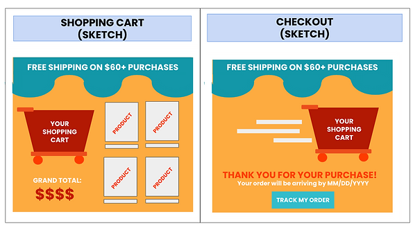
Before creating the website, I sketched out my vision of how I wanted the website to look, what colors I wanted to use, and where exactly I wanted certain images, buttons, etc. to be positioned.
Shown here are some of the mockups for the Home Page, Product Pages, "Your Cart" Page, and Checkout Page.

Digital & Print Campaigns:


To complement the website I created, I also created versatile "recruitment" ads that could be posted on social media, appear as pop-up ads on other websites, or be used as small-space print ads.


In addition to the recruitment ads, I also created a magazine print and a poster to increase awareness of
the brand's new style.